305/360° is a cutting-edge VR application designed to familiarize
and immerse new doctors and researchers with the service area of the
Sylvester Comprehensive Cancer Center in Miami. It gives prospective
doctors and researchers insight into Miami's socioeconomic status,
culture, and landscape.
Role
Data Visualization Team
- Create unique 2D mockups of 3D data visualizations
Goal
Develop unique, creative, and interactive ideas to visualize Miami’s
2D data in a 3D environment
Complications
The 3D modeler left the project. There was a gap between my team and
the developer. I stepped up and learned to create some of the
visualizations
Introduction
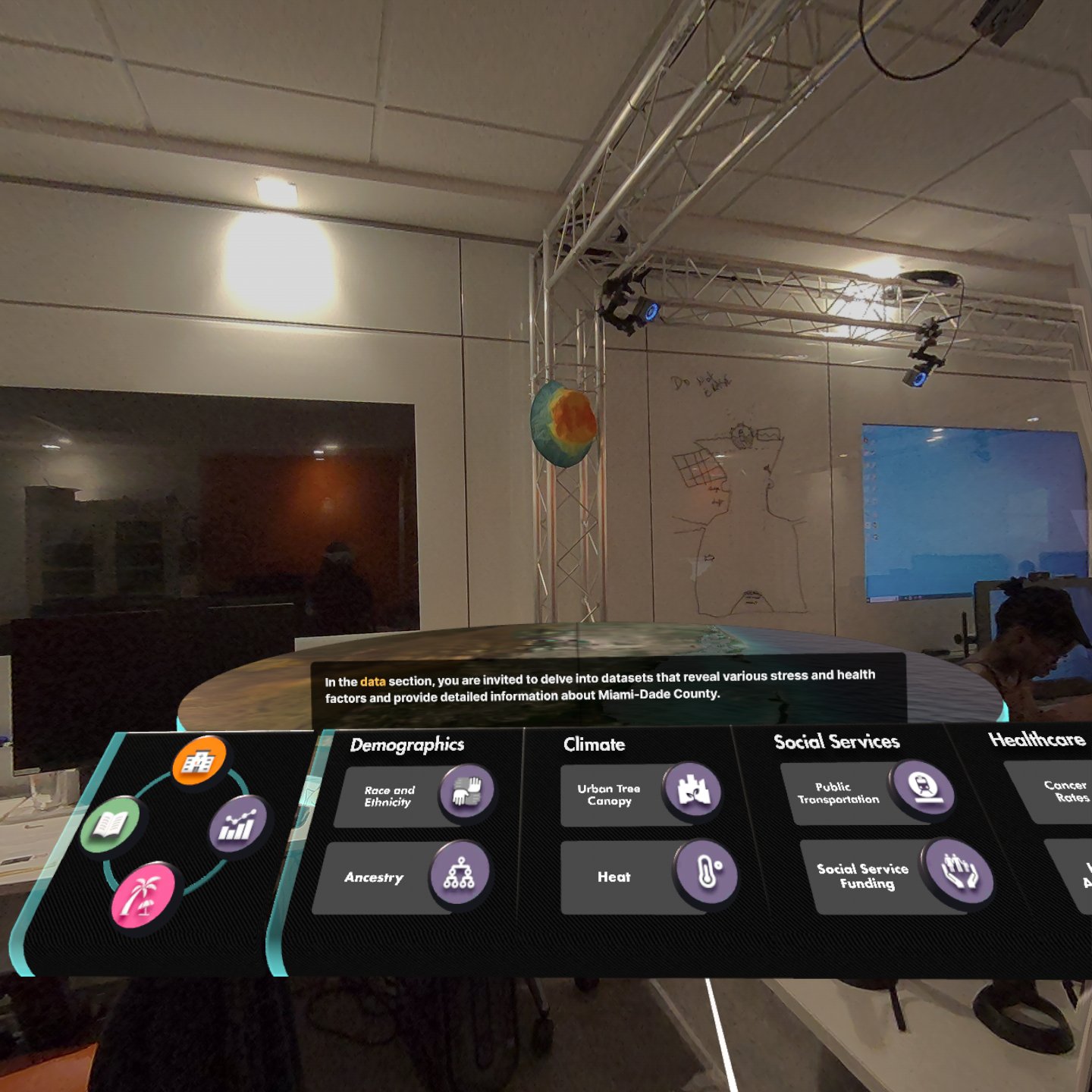
Upon clicking on the purple data icon, the panel will expand to show
additional options to explore the data section of this project.
There are 4 categories: demographics, Climate, Social Services,
Healthcare. They each have two subcategories for users to explore.
All data visualizations have interactivity for user engagement.
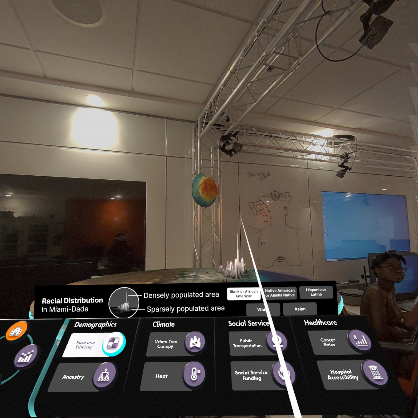
Race and Ethnicity
Description
This visualization showcases the racial distribution in Miami-Dade
County. My team and I used displacement maps to show where there
is a larger population of each race in Miami-Dade.
User Interaction
The legend is interactive and users can toggle between the races
to see the differences.
Pain Points
A couple of difficulties I ran into was how far I could extrude
the displacement map and the removal of the black background of
the image. It was difficult to remove the black background of
the image since the image is made up of black and white. We
wanted the earth map to still be visible and we achieved this by
lower the displacement map below the earth map to hide the black
background.
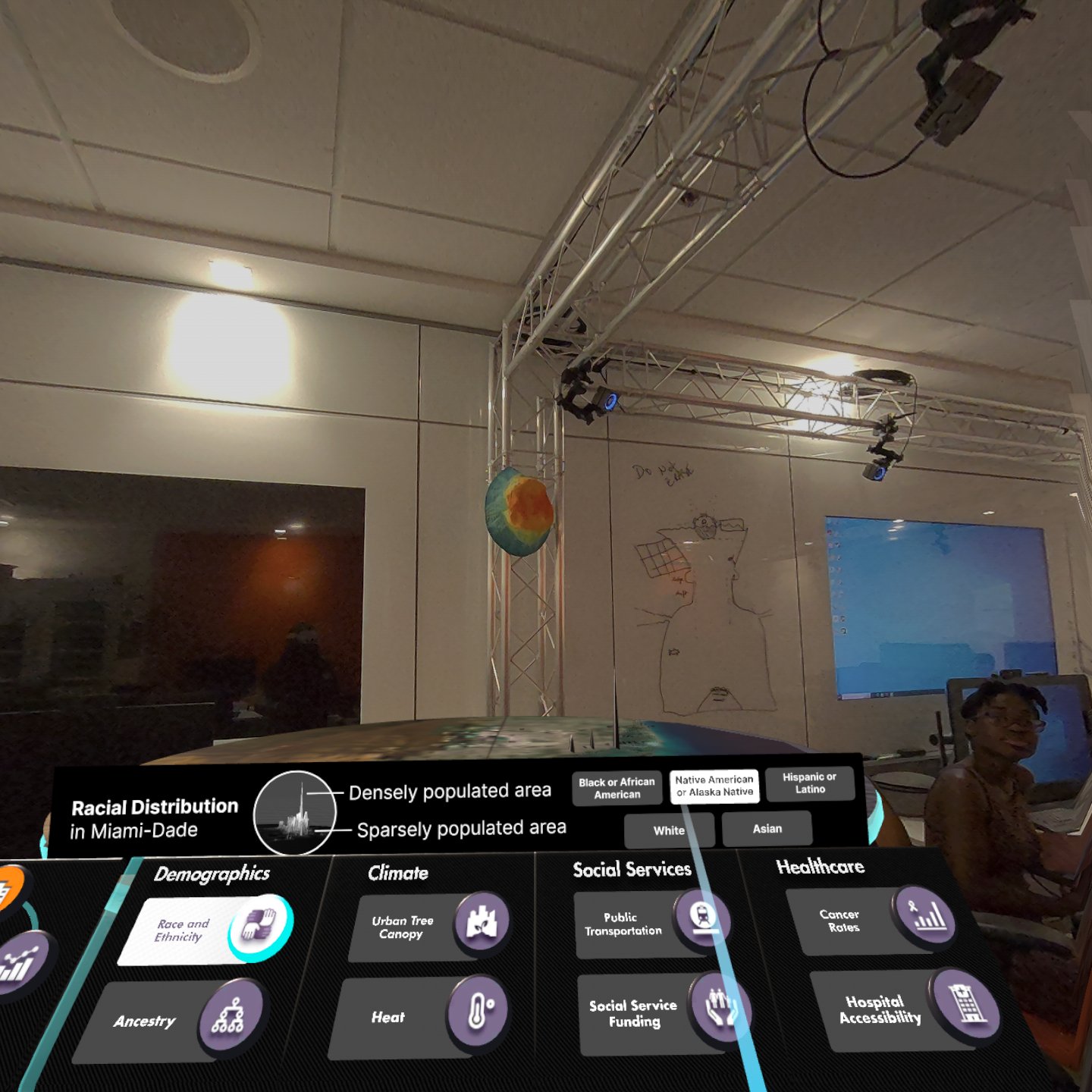
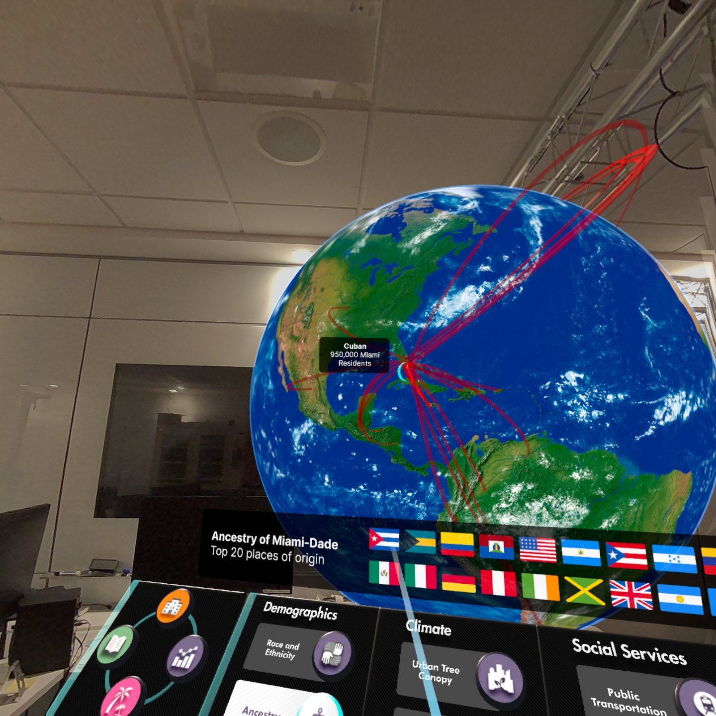
Ancestry
Description
This interactive display showcases the diverse ancestry origins of
Miami residents. Using a globe as the centerpiece, arrows extend
from various countries to Miami, illustrating the city's cultural
roots.
User Interaction
Users can explore this visualization in two ways: by hovering
over an arrow to view the number of Miami residents connected to
a specific country, or by interacting with the legend, where
hovering over a country’s flag highlights its corresponding
arrow and how many Miami residents are from that country.
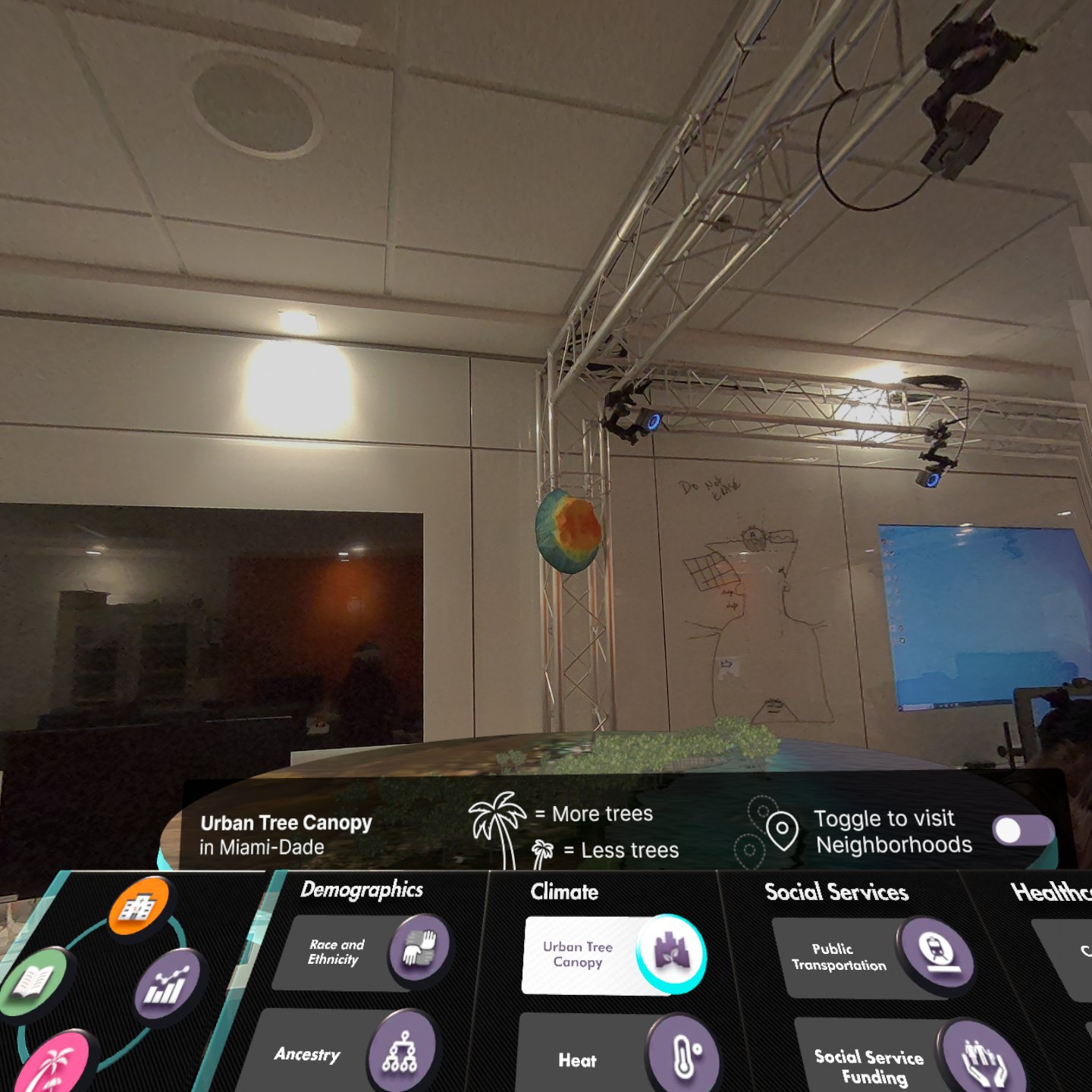
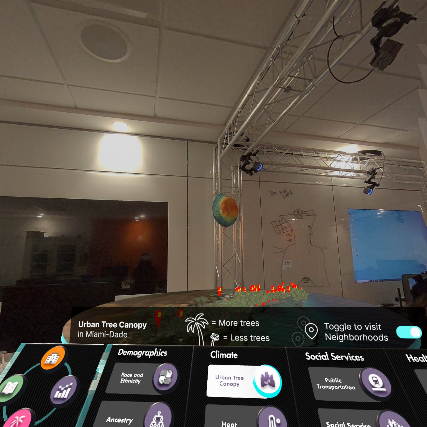
Urban Tree Canopy
Description
This visualization highlights areas in Miami with the densest tree
canopy, featuring an option to explore 360° videos of each
location. To represent canopy density, I introduced the idea of
using height, where taller trees indicate denser canopy.
User Interaction
An interactive legend enhances the experience, allowing users to
toggle video pins and explore immersive views of the areas.
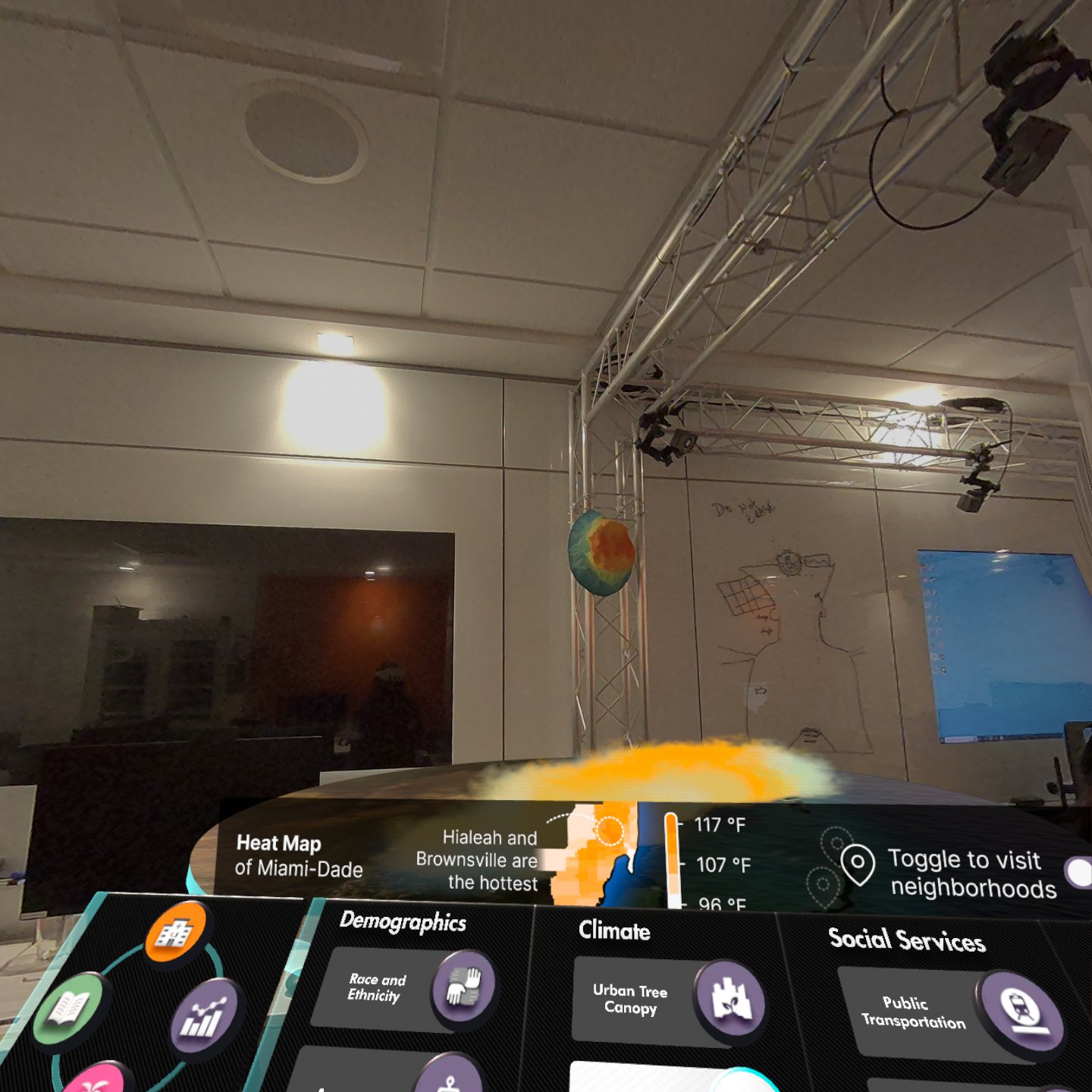
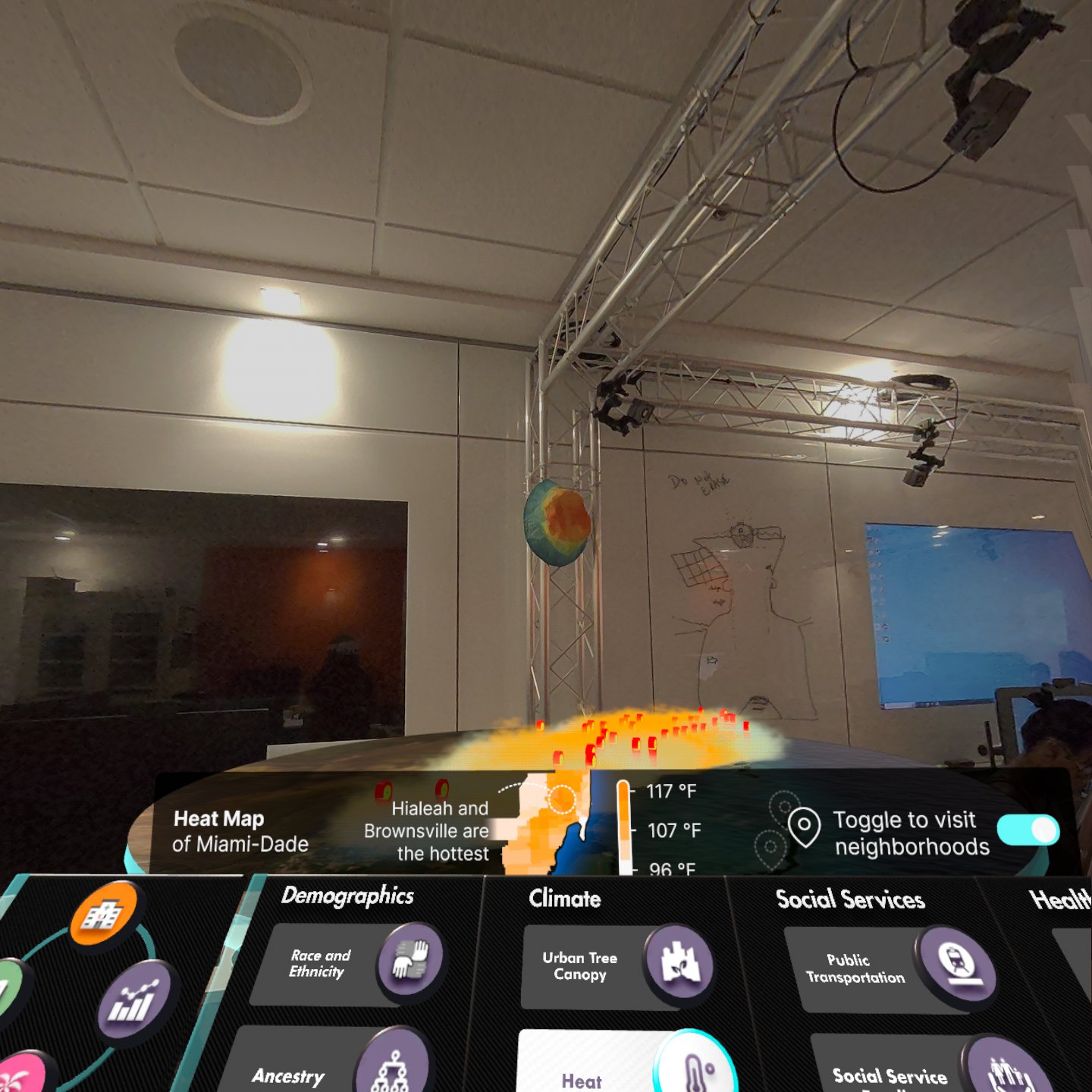
Heat
Description
This visualization highlights the hottest areas in Miami, using a
fog-like orange gradient to represent heat intensity.
User Interaction
The interactive legend allows users to toggle video pins and
explore immersive views of the areas.
Public Transportation
Description
This visualization showcases Miami’s metrorail limited reach and
service to their residents. We used an animated gif highlighting
the area codes that are accessible to the metrorail compared to
the other zip codes that are not.
User Interaction
Users are able to interact with the legend to toggle on and off
the metro rail tracks for reference.
Pain Points
This one proved to be difficult to conceptualize. Our first idea
was to create a 3D model of Miami's metrorail moving throughout
the zipcodes it services to showcase its limited reach of
Miami’s population. However, it did not work as intended and we
ended up using an animated gif as if the train was moving
through the zipcodes.
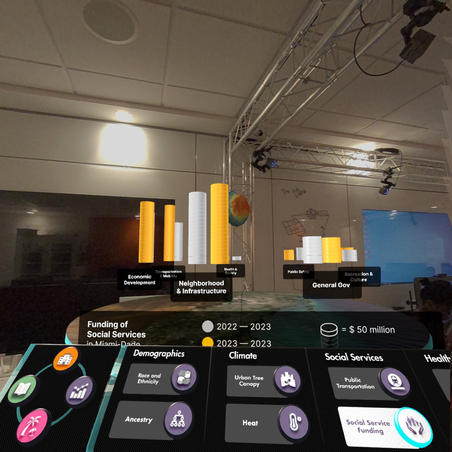
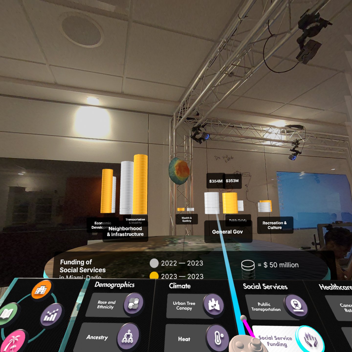
Social Services
Description
This visualization compares Miami’s social service spending for
two fiscal years and which categories receive the most funding.
User Interaction
Users can hover each stack to see the exact number spent in that
category.
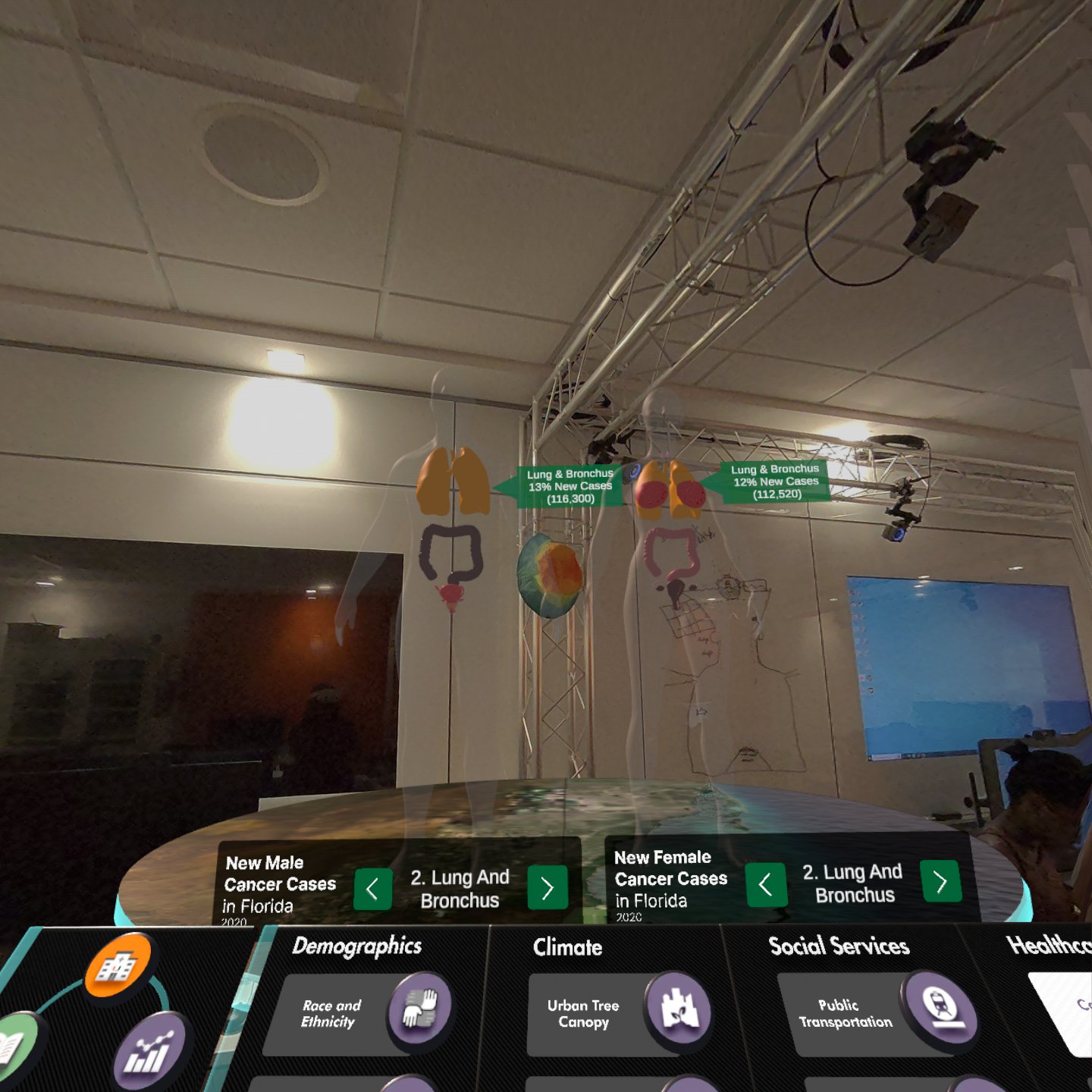
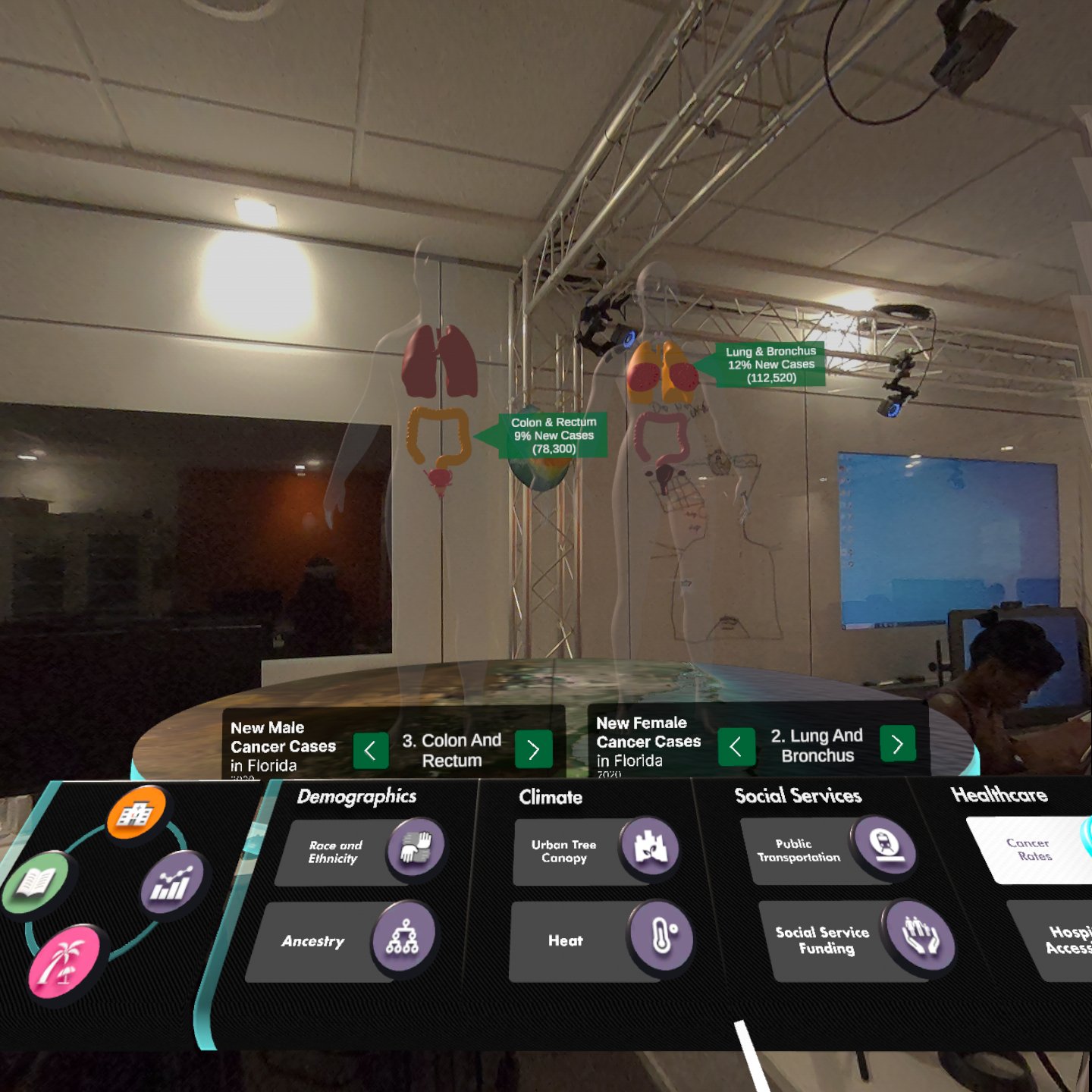
Cancer Rates
Description
This visualization showcases the new cancer rates in Miami for
both male and female.
User Interaction
Users can interact with the legends to toggle between the
different organs and view their new cancer rates percentages.
Pain Points
This sector was difficult to visualize. My team and I were
trying to conceptualize a unique way to visualize this data
outside of the traditional 2D models. We were trying to stray
away from turning 2D into 3D models replicas. Short on ideas, we
first started with a three pie chart but it was less unique and
interactive. We also wanted all the visualizations to be
different from each other.
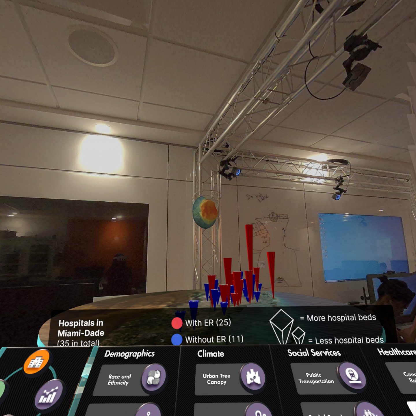
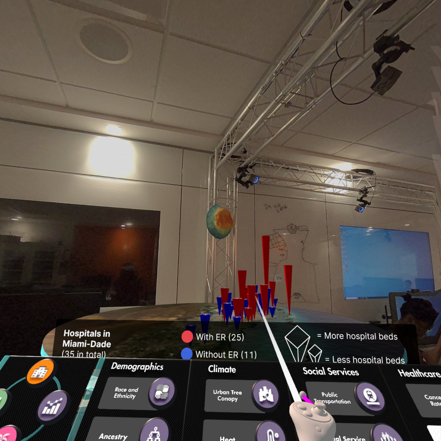
Hospital Accessibility
Description
This visualization showcases the numbers of hospitals in Miami
with ERs and those without. We used height to demonstrate how many
beds each hospital have.
User Interaction
Users can hover over each item to view the number of beds.